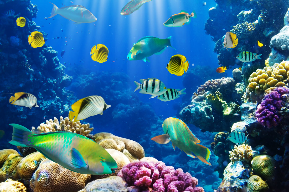
SmartPhone Nature Photography
Project Description: During this Covid 19 pandemic I have been taking way more pictures outside and have expanded my horizons. Though to begin this project I had no clue what I was doing, yet I have always loved nature photos. I researched for the first week or so and then felt way more comfortable and ready to start my project. What you will see below is 5 weeks of taking tons of pictures and narrowing them down to the best. Then you will see the edited versions that I have made using the app "Photos" on my computer.
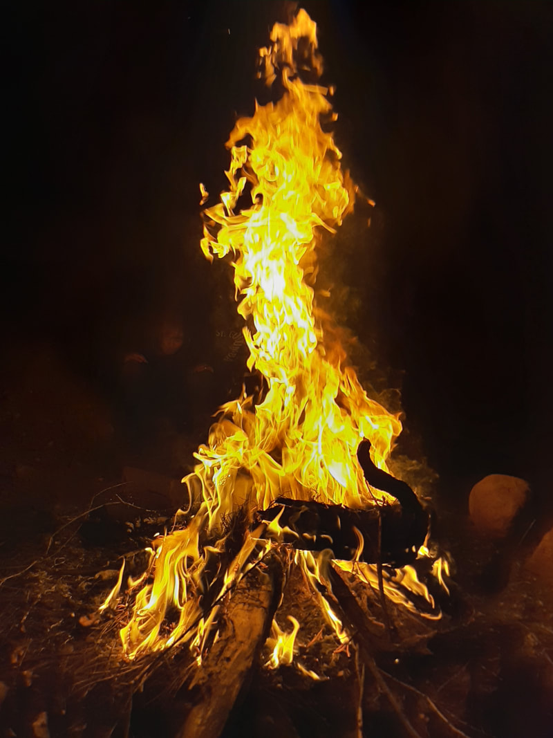
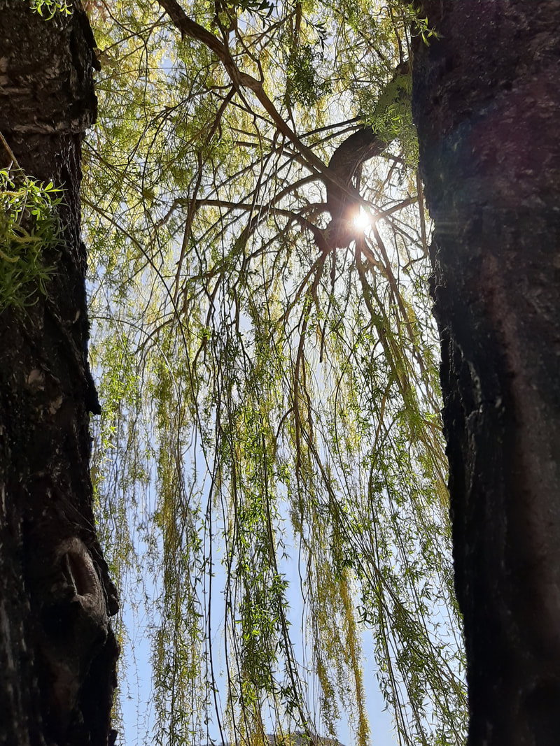
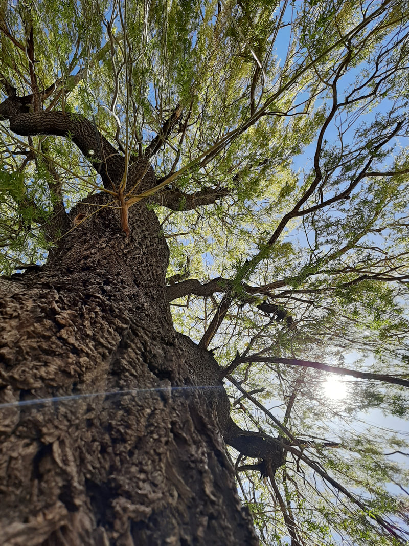
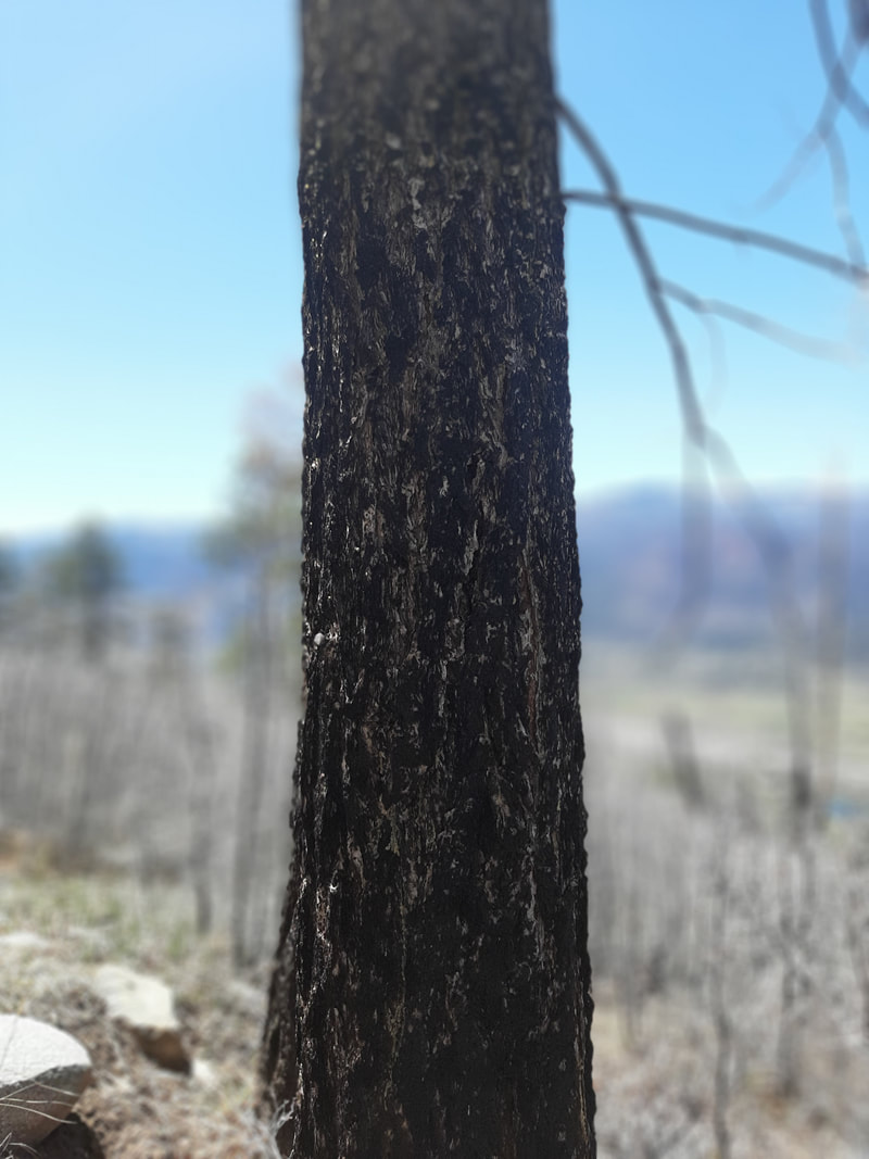
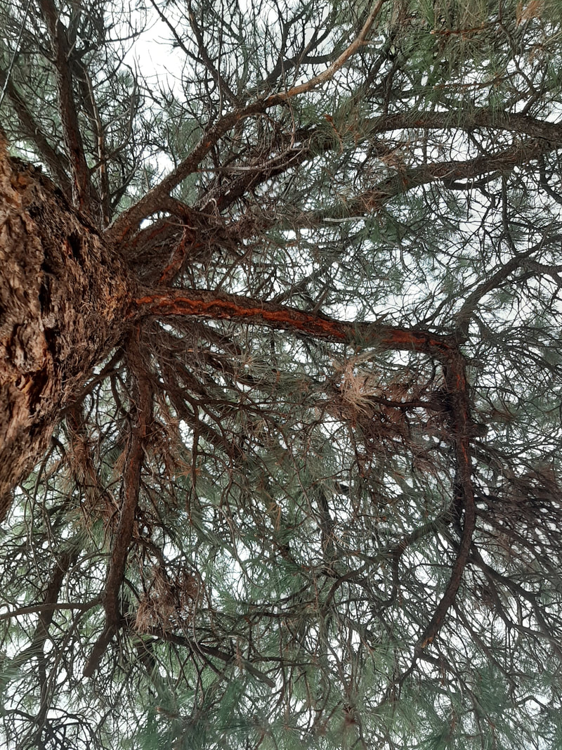
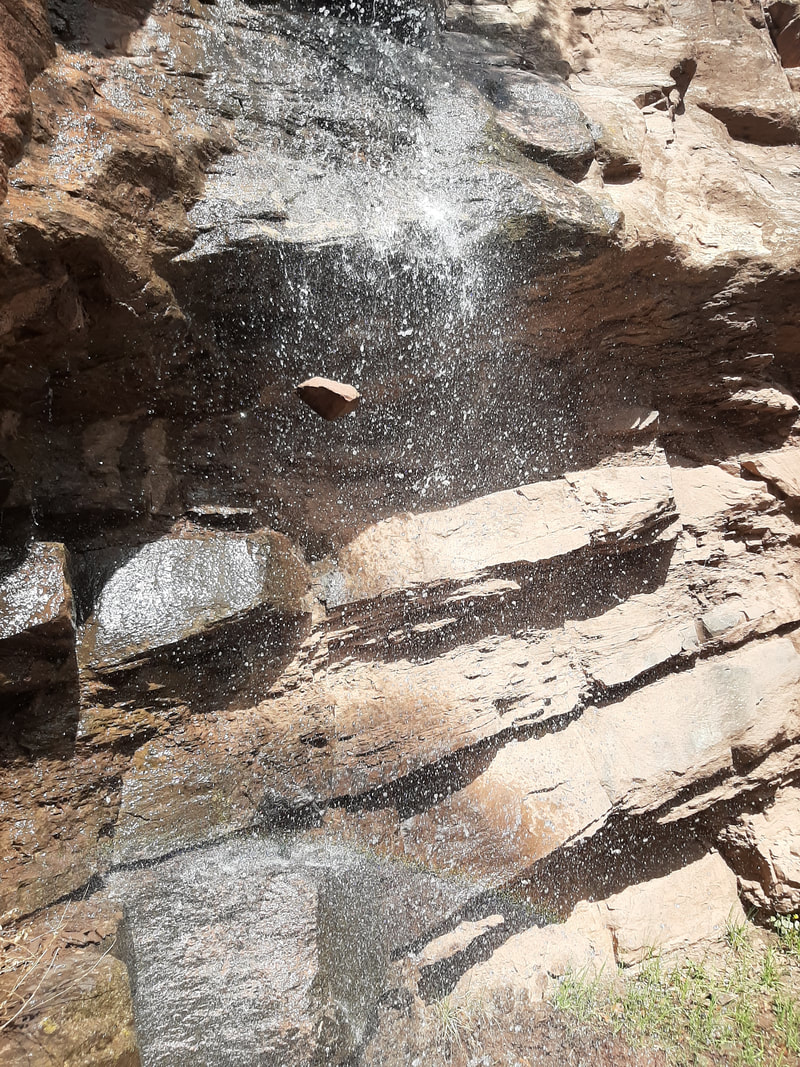
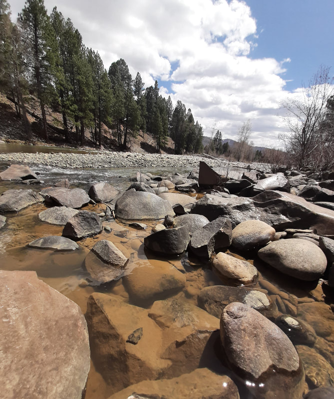
Before Image
|
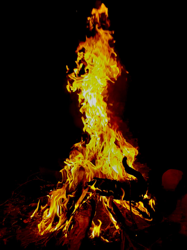
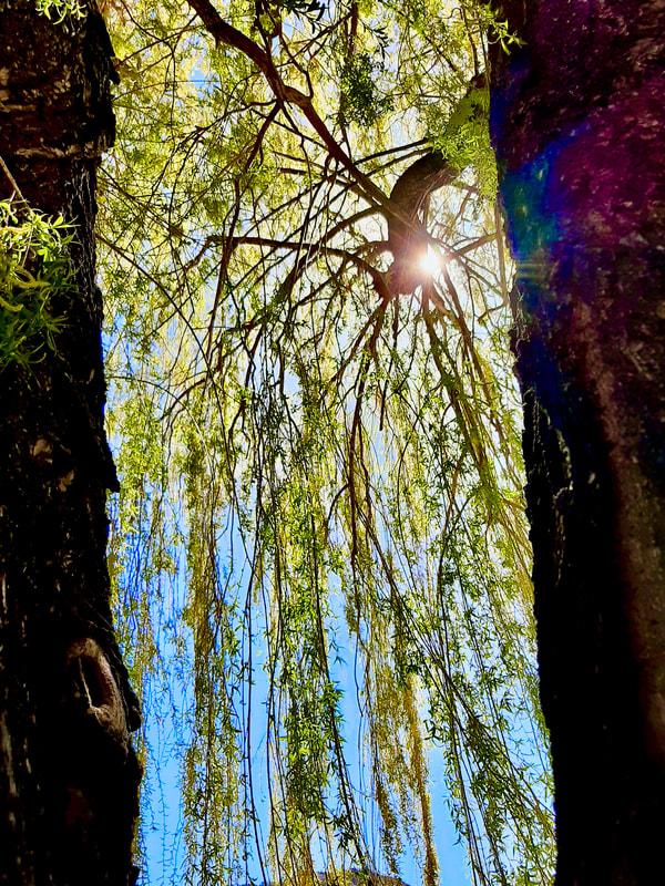
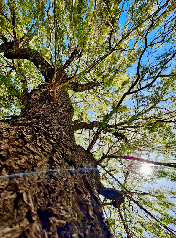
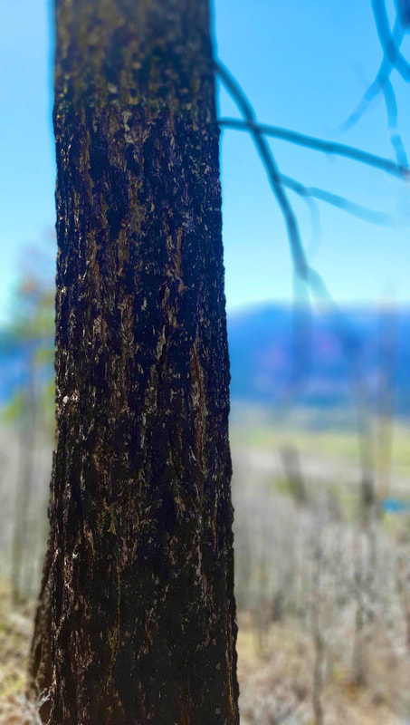
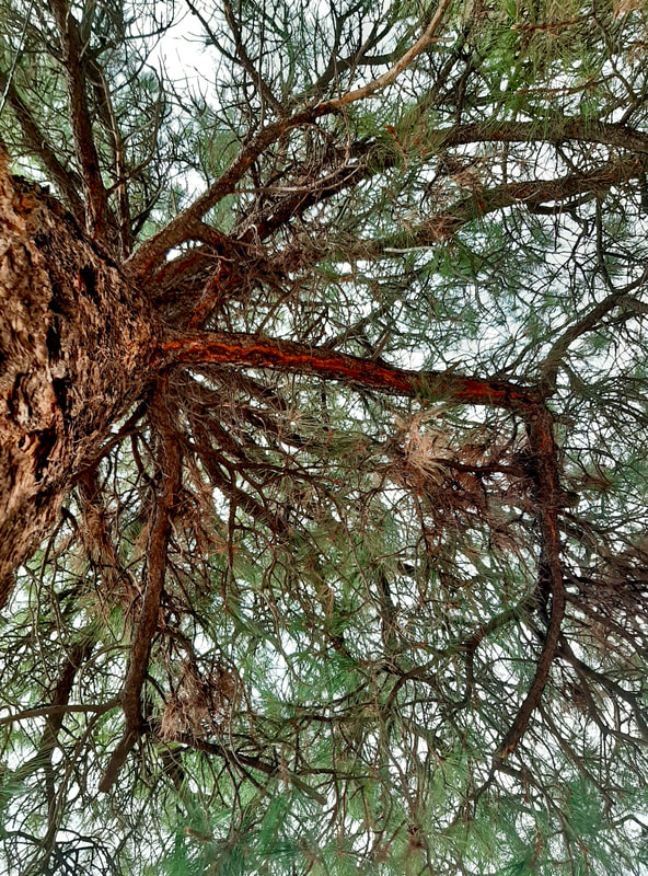
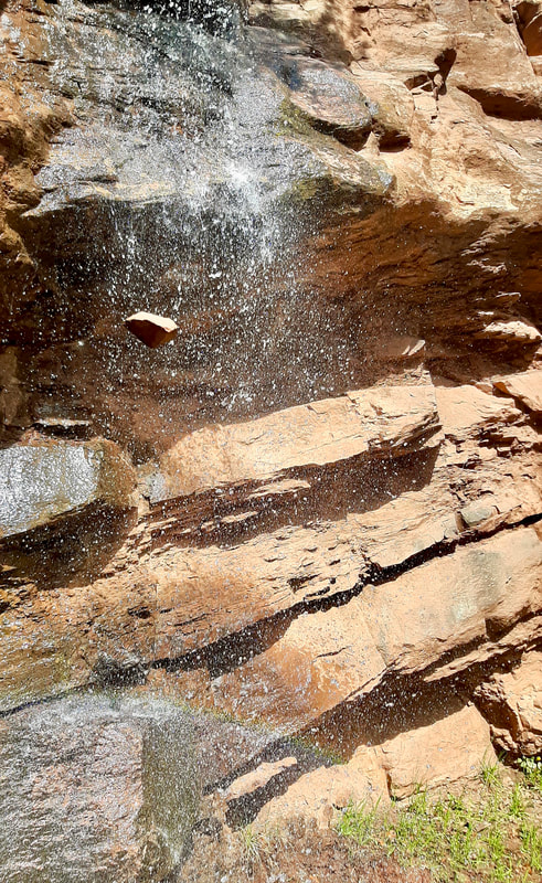
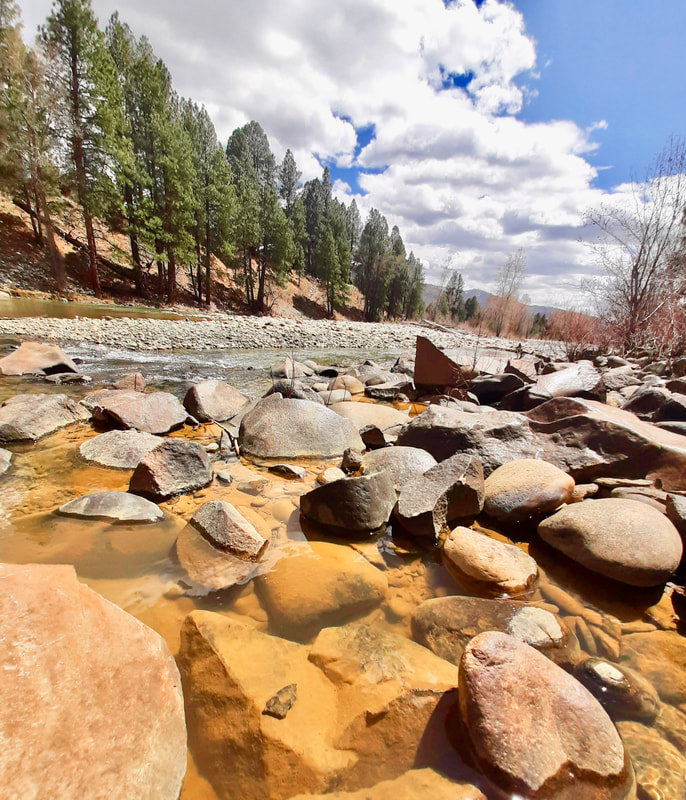
Edited Image
|
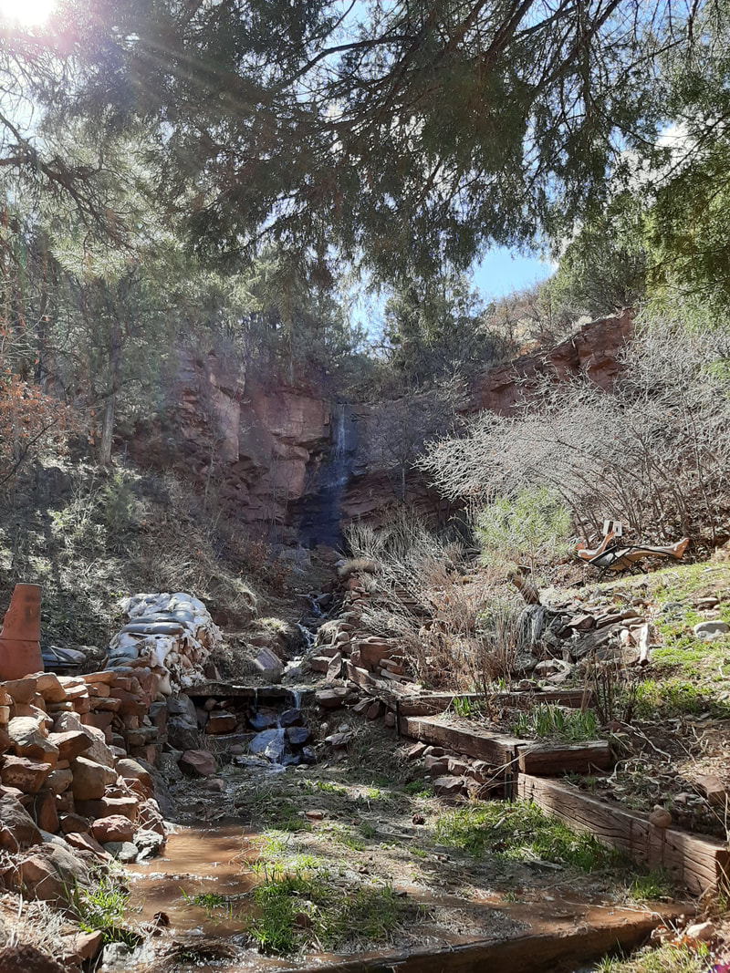
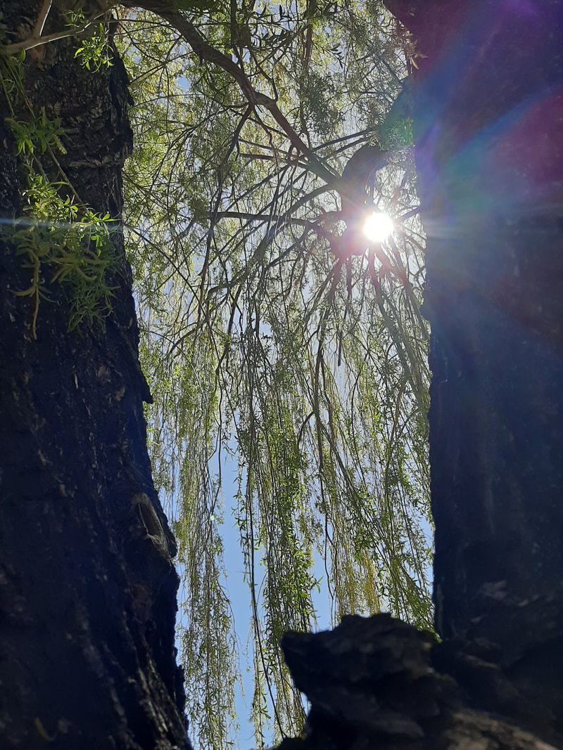
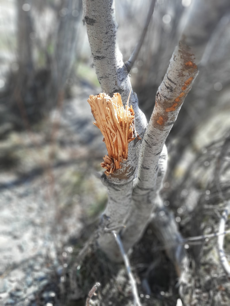
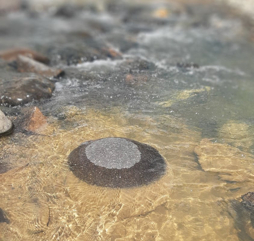
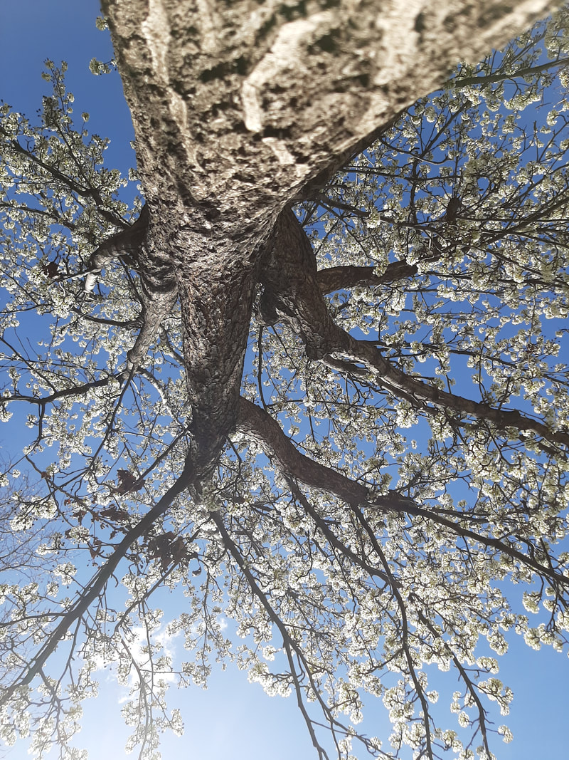
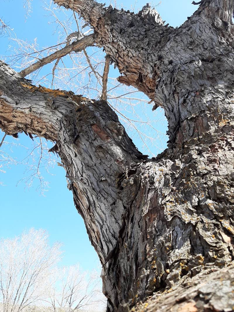
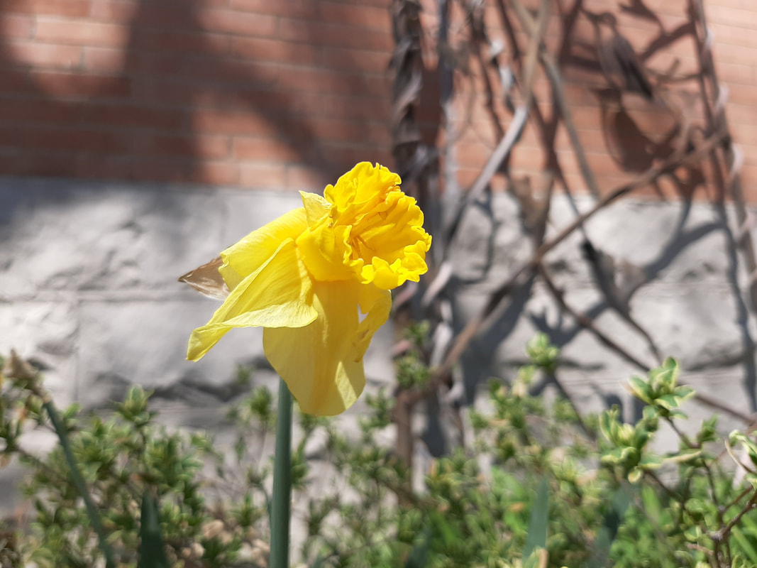
Before Image
|
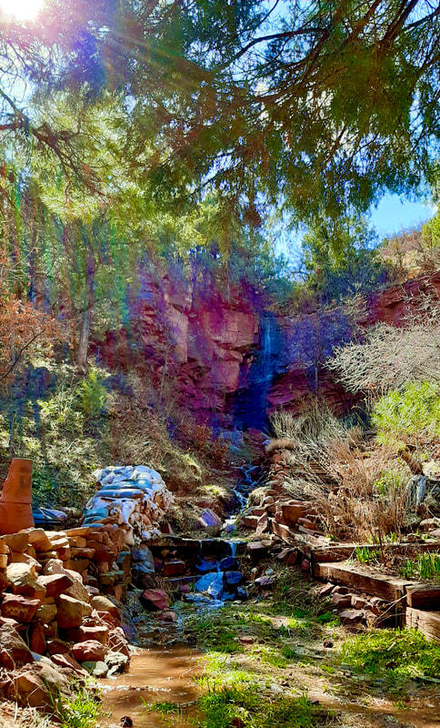
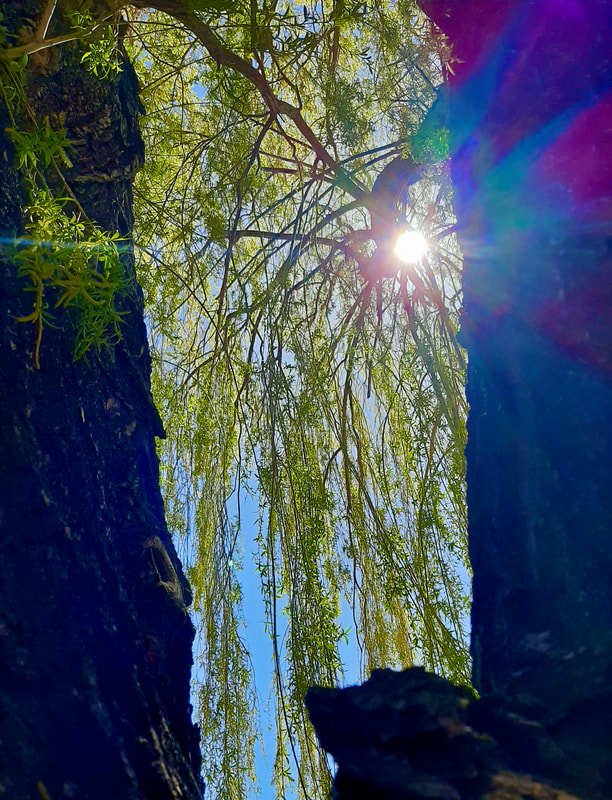
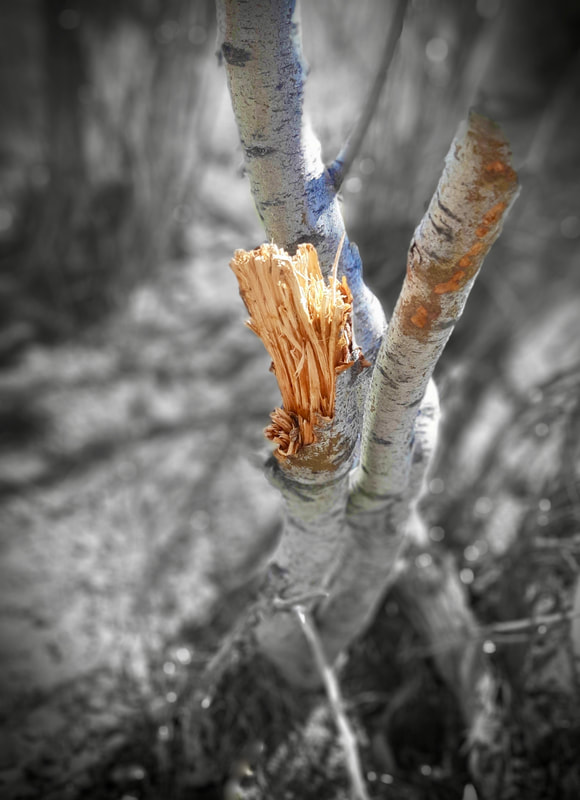
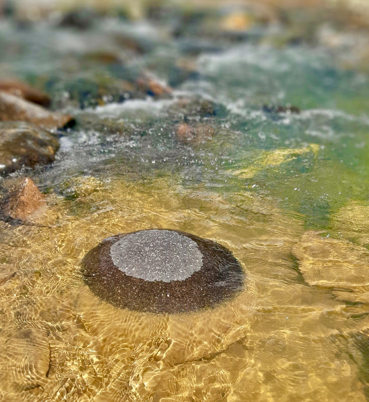
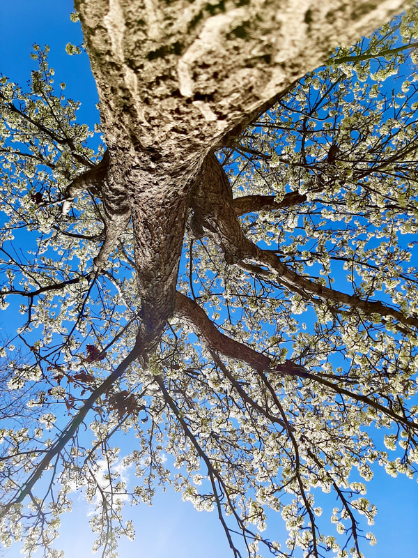
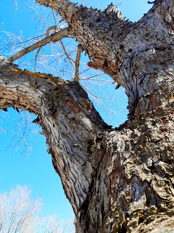
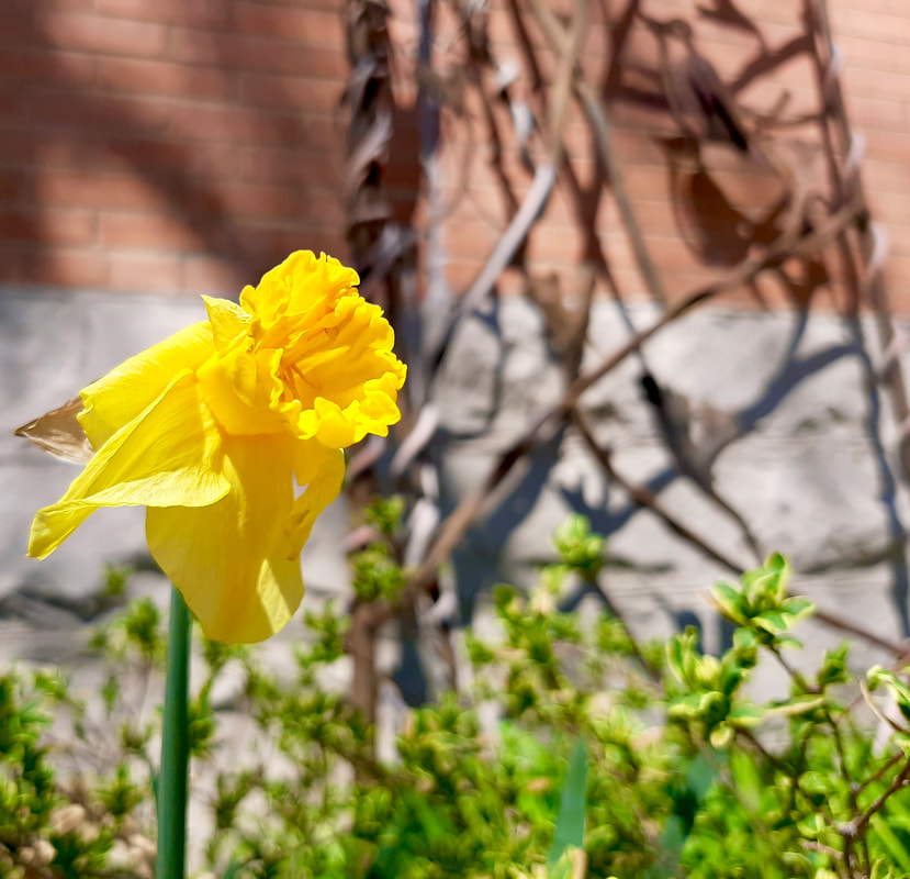
Edited Image
|
Before Image
|
Edited Image
|
Before Image
|
Edited Image
|
Before Image
|
Edited Image
|
Before Image
|
Edited Image
|
Before Image
|
Edited Image
|
Before Image
|
Edited Image
|
Before Image
|
Edited Image
|
Before Image
|
Edited Image
|
Before Image
|
Edited Image
|
Before Image
|
Edited Image
|
Before Image
|
Edited Image
|
Before Image
|
Edited Image
|
Before Image
|
Edited Image
|
Reflection: Why did you choose to create what you did, and what did you learn through your process? I have always been intrigued with photography, but I have never had the opportunity or the will to begin to learn about photography. Right away as this project was introduced I knew I wanted to make a photography project. The whole process was great and i learned so much. For example, the rule of thirds- The rule of thirds is basically dividing your photo into three portions or nine little squares using equal lines. Then it is most common to either put the main subject of the photo at any intersecting line or away from the middle of the photo. This helps the viewer focus in on one point of the photo and then make their way around the rest of the photo. It shows that they are intrigued which is a good sign.
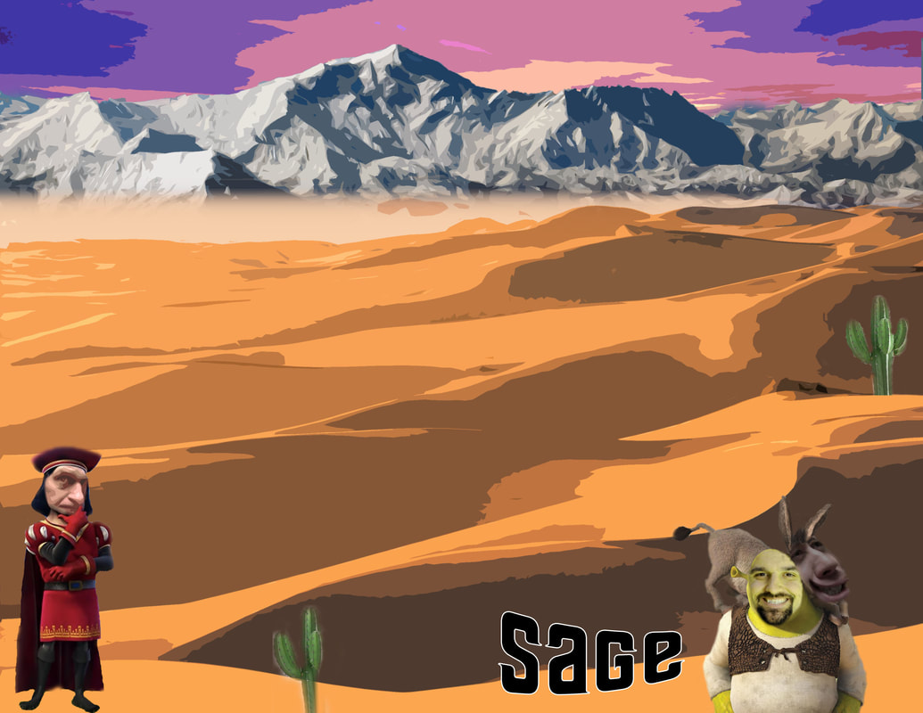
The LOGO Project
For this projectI started by sketching ideas on a piece of paper. I then scraped all those ideas and wanted to make a simple design. As you can see below under the dope designs that was my simpler idea and those were my top six. I then picked one logo and put it on Merch.
|
|

|
Reflection
Reflection
- Why is it relevant to have an eye catching logo?
- It is important to have an eye catching logo so people are brought in and intrigued by the logo. A good logo in my mind is like a hook that draws people attentions.
- Why is it important to consider a classic design?
- It can be important to have a simple design so it doesn't confuse the people looking at it or wearing it. Also some of the best designs in my opinion are the simpler ones.
- What skills were gained in Photoshop and/or Illustrator?
- During this project I learned how to trace with a pen/pencil tool and use different types of paint brushes to strengthen my project. I also learned what is aesthetically pleasing and used that while putting my logo on my Merch.
Teacher Creature
Final Project Above
|
|
I have grown immensely through the semester through Photoshop. For example I started being extremely reliable on Roxy now I feel comfortable doing things on my own. I am extremely proud f the work I have done and there is always room for improvement my mind. I do believe I have grown in so many ways regarding skills I have gotten and used.
|
Original Pictures Above
Headers Project:
Project Description: This project we watched the documentary Helvetica to learn about fonts. After that we downloaded fonts onto our computers and started to make headers on Photoshop for our Digital Portfolios. We then made the headers and put them on top of our screens on our pages and that was our headers project.
|
Initial Image
|
Final Product
|
|

|
|
Initial Image
|
Final Product
|
|

|
|
Initial Image
|
Final Product
|

|

|
|
Initial Image
|
Final Product
|

|

|
|
Initial Image
|
Final Product
|
|

|
|
Initial Image
|
Final Product
|
|

|
|
Initial Image
|
Final Product
|
|

|
|
Initial Image
|
Final Product
|

|

|
Photoshop Tutorials
What are your biggest "Take Away's" from having done this project?
|
My biggest take aways from this project are definitely my capability and understanding of the photoshop tutorials. They came to me like a piece of cake and I am glad that I have this skill now to used in the future. I definitely believe that in the next project I should stay more focused on my work and be less distracted by my peers so I get my work done quicker and more efficient. However I am glad I have these new skills and next time will be a better student or in these terms talk less and be focused more.
|

Original
|
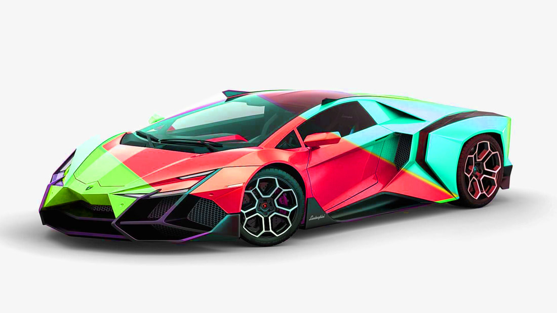
Photo shopped
|
I started out by opening the image in Photoshop. Then I used the pen tool to make a selection around the car. After that, I clicked on the effect of hue saturation and changed the color and saturation of the Lamborghini. Then I repeated these steps and made selections in different parts of the car to make different sections of the car different colors. I also changed the saturation, and messed around to see the different outcomes of different saturation levels within the colors I changed.

Original |

Photo shopped |
I started out by using the horizontal text tool to type the word sunset on the image. Then I made the text into a big bubbly font. Then underneath the image I added another white layer and held down alt between the image and text layers. When the mouse changed its position I clicked once and then selected create a clipping mask in the text. Another, way you can create a clipping mask is by right clicking in between the initial image and text layers, then click create clipping mask. Then finally I repositioned the image in the text to make it look good and went to the effects and customized the stroke of my text.
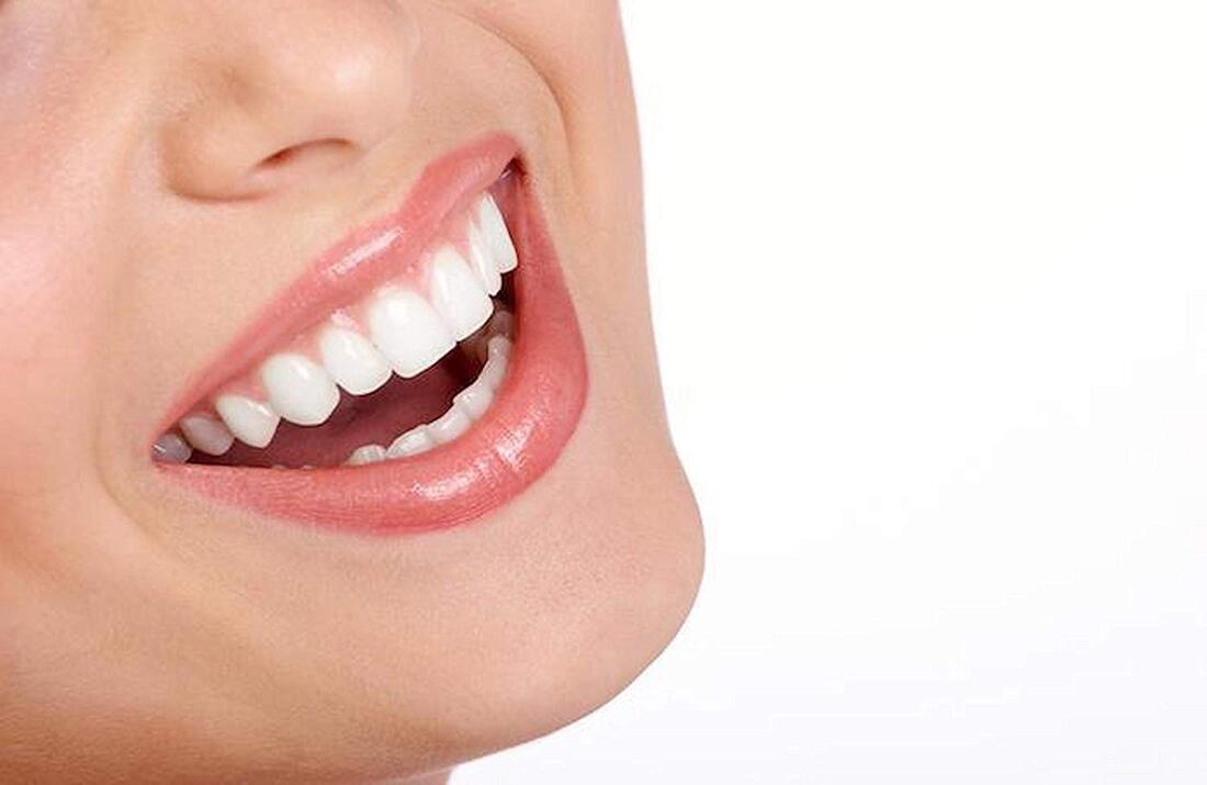
Original
|
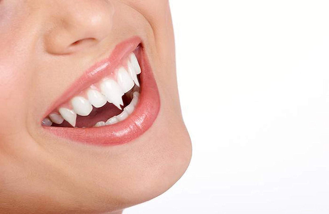
Photo shopped
|
I started out by using the pen tool to make a selection around one tooth. Then I changed the feather radius of 1 and began the next step. Then I made a new layer and do a layer via copy. Then I clicked edit and transform, and then warp and make your vampire teeth to your perfection. Finally I used the eraser tool to clean up the edges and repeat'ed the steps for the rest of the teeth.
